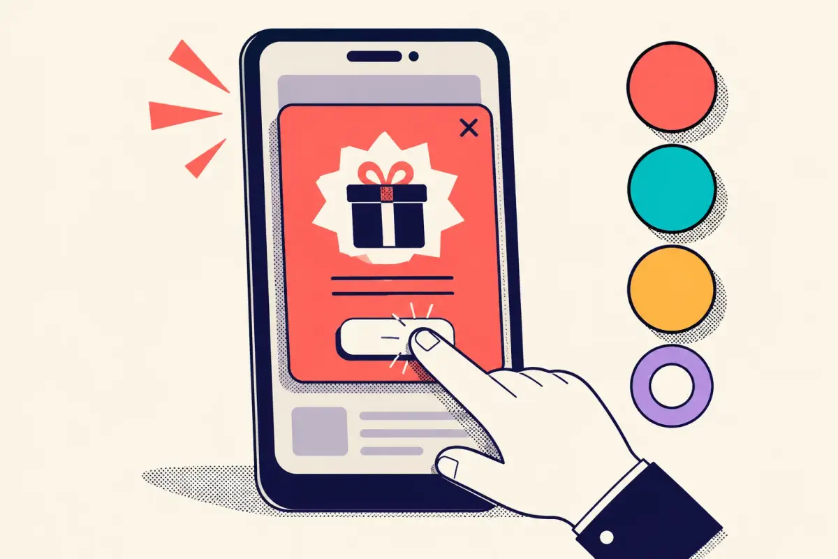
Your desktop conversion rate does not predict your mobile one. They're different devices, different attention spans, different physical constraints — and most of your popup impressions are phones. A popup that converts beautifully on a laptop can quietly fail on mobile, and a blended number hides it. Three rules fix most of what goes wrong on small screens.
The through-line: a mobile popup isn't a desktop popup that got smaller. It's a different design with different constraints, and treating it as one thing is why so many stores leak conversions on the majority of their traffic.
1. Design mobile separately
A responsive popup shrinks. A mobile-designed popup is rebuilt for the thumb. Those are not the same thing, and the gap between them is where mobile conversion lives.
- Reach the thumb. The primary action has to sit in the natural arc of a thumb on a one-handed grip — lower and centered, not tucked in a top corner. Anything the shopper has to shuffle their hand to reach costs you taps.
- Size the targets. Buttons and close controls need to be genuinely tappable — around a 44px minimum touch target, well-spaced so a fat-finger tap doesn't hit the wrong one. Cramped controls read as broken.
- Keep the input keyboard-safe. When the shopper taps an email field, the on-screen keyboard slides up and covers the bottom of the screen. If your submit button lives there, it just vanished. Position the input and action so the keyboard never hides the thing the shopper needs to tap next.
The keyboard is the number-one mobile popup killer.
More mobile popups fail on keyboard handling than on anything else. Test every popup on a real phone with the keyboard up — not just in a resized browser window. If completing the form means scrolling blind or dismissing the keyboard first, you'll lose shoppers who fully intended to convert.
2. Respect Google's interstitial rules
On mobile, an aggressive popup isn't just an annoyance — it can cost you search visibility. Google's guidance on intrusive interstitials flags popups that make content less accessible on mobile: ones that cover the main content immediately on arrival, or that a shopper has to dismiss before they can read anything.
The practical takeaways are simple and they happen to be good UX anyway. Don't fire a full-screen popup the instant a visitor lands from search — use a delay, a scroll trigger, or exit intent so the shopper sees your content first. Keep the popup a reasonable size rather than a wall. And make the close control obvious and easy to hit. Google explicitly carves out exceptions for legally required notices like cookie and age gates; a well-timed marketing popup that lets the shopper reach the content isn't the target. Timing and size keep you on the right side of the line.
3. Make the game touch-native
Gamification is a bigger advantage on mobile than on desktop, but only if the game is built for touch instead of ported from a mouse.
- Spin with a flick. A wheel a shopper spins with a thumb flick feels alive; one that spins only from a button tap feels like a slideshow. And the wheel needs enough size to read as real — a tiny wheel makes shoppers doubt the spin is random.
- Scratch with a finger. A scratch card popup is one of the most natural mobile mechanics there is, because scratching with a fingertip is a gesture people already know. The physical-feeling reveal lands harder on a phone than any static discount box.
- Add haptics. A light haptic tick as a wheel passes each slice, or as a scratch reveals the prize, makes the interaction feel tactile and real on devices that support it. It's a small touch that measurably lifts engagement — and it only exists on mobile.
The same mechanic that lifts desktop conversion lifts mobile more, precisely because touch and haptics give the game a physicality a mouse can't. A spin-to-win popup for Shopify built touch-first is doing work on phones that a static form simply can't.
A mobile popup isn't a desktop popup that got smaller. It's a thumb-first design with its own rules — and it's running against most of your traffic.
Build it for the thumb, not the mouse.
WooHoo popups render mobile-first — touch-native games, keyboard-safe inputs, sensible triggers — so the majority of your traffic gets a popup that was actually designed for it.
Three rules, every metric
Design the mobile popup separately for the thumb. Time and size it so Google — and your shoppers — can still reach the content. And make the game touch-native, with a real gesture and a haptic tick. Do those three things and you stop leaking conversions on the device most of your visitors are actually holding.
Frequently asked questions
Are popups bad for mobile SEO?
Only intrusive ones. Google's guidance targets mobile popups that cover the main content immediately on arrival from search or that must be dismissed before the shopper can read anything. A popup that fires on a delay, scroll, or exit intent, stays a reasonable size, and is easy to close is fine — and it's better UX regardless.
Why does my popup convert worse on mobile than desktop?
Usually keyboard handling and touch targets. When the on-screen keyboard opens it can hide the submit button, and cramped or hard-to-reach controls cost taps. Rebuild the popup for one-handed use — thumb-reachable action, roughly 44px touch targets, and an input positioned so the keyboard never covers it.
Do gamified popups work on mobile?
Very well, when the game is touch-native. Spinning a wheel with a thumb flick, scratching a card with a fingertip, and a light haptic tick on each interaction make the mechanic feel physical in a way a mouse can't. Gamification tends to be a bigger advantage on phones than on desktop for exactly this reason.